Tuesday, May 31, 2011

Hey everyone, sorry I couldnt make yesterday.

Can anyone from Graphics meet up tomorrow (wednesday) around midday? or maybe Thursday afternoon? Or even Friday?

- Cam

Monday, May 30, 2011

Week 12


Hi all, I've just made the final lecture for this course available. Scheduled in the course documents to be a session reveiw I have actually baased the lecture in the theme of New Trends in Publishing. Without doubt we need to contextualise this lecture within all the material covered to date in the course. You need only revisit all the lectures and the blog itself to see how much ground we've covered.

Starting with the hands on techniques of Letterpress, moving through Book Design and now on to the world of Online Publishing you can see how we have pursued an underlying theme of technological development that reflects actual evolution in publishing and graphic design itself. This week's lecture further emphasises change as the only constant in publishing. With the tremendous challenges faced by the industry due to new models of production, content creation and user expectation this will only continue to be the case.

I'd like to emphasise this even further by encouraging you to view the fascinating video above.

Finally I'd like to also encourage you to post to the blog a 300 word (max) reflection on your experience in the course. It's the final Studio Research 8 (SR8):
due Project 3 Deadline
Write a 300-word (max) reflection on the course and post to the blog.
Maybe some ideas for the FFI logo, calligraphy style?


Thursday, May 26, 2011

Deadline #1

Alright, so today is the first official deadline. Style team and Editorial team should have their emails sent out by the end of the day. Can't wait to see what you guys have come up with!

Also, I saw Herman the other night, and he told me that the Graphics team is working on the logo and the cover this week. They should be done with that by Friday I believe.

Thanks guys!

Monday, May 23, 2011

Contacts/Timeline

kritt001@rangers.uwp.edu; Lauren--style
lanna9012@gmail.com; Alanna--graphics
cam.wall@yahoo.com.au; Cameron--graphics
sachiko.kumazawa@gmail.com; Sachiko--editorial/style
hermanli_1988@yahoo.com.hk; Herman--style/graphics
heyitsemilia@hotmail.com; Emilia--web
rmc.gadil@gmail.com; Carissa--editorial
justinjtyuen@gmail.com; Justin--editorial
magzi99@hotmail.com; Margarita--graphic/style
ces212@lehigh.edu; Chelsea--manager

STYLE GUIDE TEAM-- Come up with the grid system by Thursday and email to graphics/web team and manager.
EDITORIAL TEAM-- Come up with 1st section's content by Thursday and email to graphics/web team and manager.
GRAPHICS TEAM-- Once you receive info from the editorial/styles teams, start working on templates over the weekend. Come into Monday's class with at least 3 examples altogether (if you can't meet up, have everyone do one version).
WEB-- Come up with some templates/proposals. Post on blog or bring them in.


Just so everyone knows, here is the timeline that we are aiming for:

THURSDAY 26/5-- Style team should be done with grid system, email to graphics/web teams and manager. Editorial team should be done with the content of the 1st section, email to graphics/web teams and manager.

MONDAY 30/5-- Graphic Design team comes into class with 3 different versions for the first section.

WEDNESDAY 1/6-- Editorial team should be done with second and third section, email to graphics/web teams and manager.

SATURDAY 4/6-- Graphics team gives at least 3 versions of both the second and third sections.

Good luck everyone!

File Preparation for Print Publications

This week's lecture on File Preparation for Print is actually delivered in the form of resources (listed blow) that provide clear and crucial information about this absolutely vital area of the designer's skillset. The job is not finished when you complete the design – after that we speak of the printing workflow.

1. "How does commercial printing work?"

This video has been conveniently uploaded to You Tube by a small but typical printing firm. It's a good solid overview of the processes graphic designers need to understand in order to produce files that can be reproduced correctly on an offset printing press. Almost all large print run jobs (including newspapers and magazines still use the offset process. There are a number of other relevant videos to check out alongside.


2. Pass4press standards for file preparation
The other resources are based around a link to the Pass4press website which has for around a decade been able to provide designers working in the publishing area of the industry with up to date information about the specifics of file preparation. Almost all work for print is now prepared as pdf files. This is not just as straight forward as exporting your artwork as a .pdf file however and so the array of resources available here is an essential reference. Pass4press describe the resource as follows.

Pass4press is a set of standards, introduced and maintained by PPA, that ease the way for the supply of digital advertising to magazine publishers and their suppliers. The best practice guidelines detail how to create reliable, print-ready PDF files. A PDF file which complies with Pass4press specifications should require no additional handling instructions. Pass4press aims to increase predictability and reliability within digital workflow.

An important consideration with print is that there is an incredible amount of variation between the technologies that printers across the industry use. For this reason note the previous versions of the material on Pass4press. Don't assume your printer can accomodate the very latest version of the software or files. A key rule is always to discuss your job with your printer - it's crucial!

Check out Pass4press here paying particular attention to the Pass4press v10 Complete Brochure:
http://www.ppa.co.uk/resources/guides-and-standards/production/pass4press/

Although you are not necessarily preparing files for offset printing in your current project you will undoubtedly encounter this task early in your career as a designer. The level of technical detail and required attention to detail is however completely congruent with your current task of designing a downloadable magazine. These are vitally useful resources. Please make sure you check them out and reserve them for future reference - you'll need them I'm sure.

Finally, as we are approaching the end of the semester and your are all closely engaged with the preparation of the current project there is no specific studio research task associated with this week's activities.

Saturday, May 21, 2011

Editorial Team's latest update

Hi all

Carissa, Justin and I met yesterday to discuss the written content of the publication and were concerned with making the copy contemporary, dynamic and at the same time malleable for the other teams to work with.

We've come up with this idea of an interview structure, with handwriting being the interviewee. We're coming up with questions such as 'How did you feel about yourself back in the 20's?'. Handwriting would respond with her account of the status handwriting had at the time. So while the text would be colloquial and comic, it would also incorporate the periods we've been looking at, of pre-modernism, modernism and post-modernism, and changes in opinions of handwriting and mechanical type etc. Of course the text will not just be comic and will have descriptive and factual substance. The primary aim is still to inform.

We want the design team to be able to come in and move text around, cut some out and contribute their own if they feel necessary, in order to bring this all together harmoniously. So we'll come up with enough text to be able to cull between ourselves, and that will be able to be culled if necessary in the other teams.

Please comment your thoughts to this. The more the merrier.

Sachiko

Thursday, May 19, 2011

PS--Just wanted to make sure everyone is getting my emails, please let me know if you aren't! I just sent out an email with the ffi files that Wing gave me in class.

Monday, 16th of May

Here is the process of our thinking from Monday’s class. Once again, it's a bit brief and random because I was just trying to capture the ideas that everyone was blurting out, but if you were in class it should make sense and just be a refresher. We ended with a narrowed down idea of what we want our content to be. We are going to have three sections: 1. The development and brief history of handwriting and why it was so important back in the day before technology took a huge leap, 2. How the advancement of technology changed/replaced handwriting (modernism), and 3. How handwriting and technology are now working together, handwriting is making a comeback (postmodernism)

Paragraph at start about how technology has changed handwriting through time

Grandparents/parents have really good handwriting from their generation, our generation writes messy, then we start using typewriter and then keyboard and now just our fingers with the ipad.

The whole entire publication will pose a question: how we think handwriting within typography will progress in the future…

the future of handwriting

Relationship between your hand and the end result

Difference between how you used to use your hands while handwriting (from pen usage to keyboard to ipad to even speaking into a computer)

Relationship btwn technology and typography

-Emotive

-Language and communication

-physicality of typography (hand, typewriter, keyboard, iphone, tablet)

-Handwriting as typeface

-Handwriting in graphic design

Possible titles:

reinterpreting handwriting

reflections on handwriting

grid structure should reflect the content

the handwriting (content), and the way you use hands, the grid structure will be different

how handwriting has embraced technology

HERE ARE OUR THREE SECTIONS:

1. how handwriting developed

2. how technology has changed handwriting (relate to modernism)—handwriting gets dumped

3. how handwriting is now changing technology (postmodernism)—handwriting makes a comeback

when advances in technology and demise of handwriting clash

-the graphs: first one shows the rise of technology, second one shows the demise of handwriting, and third one shows them meeting in the middle and becoming one.

how we will never stray away from handwriting—the legacy of handwriting

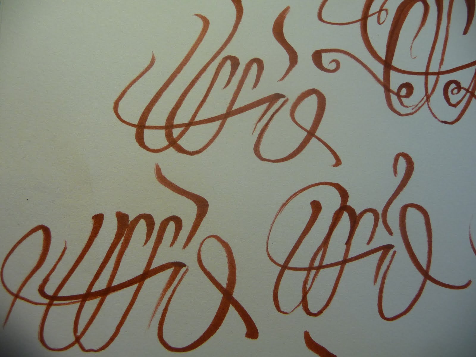
we could use our own images—calligraphy

teams should meet up and discuss ideas and make up some images before Friday

editorial team (Sachiko, Justin, Carissa)- work on content, bring in print outs, exchange files

style guides team (Lauren, Sachiko, Herman, Margarita)- draft of structure (should be a flexible structure)-- headings, subheadings, size of font, what font we’re using

graphics team (Alana, Herman, Cam, Margarita)- examples of some images, sketches, include logo

Wednesday, May 18, 2011

ideas {layout + font}


Hi People

There are some ideas of the double page spread layout,  according to my research the layout of the print matters in the past are mostly text, images not usually not the focus of the page. They usually placed on the side or off-centered. After the development of technology, quality of colour printing and camera got improved, images started to occupy more space of the prints.
As we have discuss that we should have a flexible layout and grid system, and could be made a little difference between the different sections of the book. The black box represent the image.

the font selection 


Body text //
I suggest using Century, Gill Sans or Helvetica as they are the typeface which are commonly used nowadays and they had been exist for a long time, Century(1894), Gill Sans(1928) and Helvetica(1957) I think they are the appropriate choice for the book, with the topic we are working on.

Title //
We sort of decided the 3 sections for the book - Decline of Hand-Writing , Progress of Technology , the Merge and the future...
{Decline} using calligraphy style font - Edwardian Script , Lucida Handwriting , Zapfino
{Progress} using the significant typeface of the period 1901~1975 - Bauhaus , Eurostile ,  Futura
{Merge} digital mimic hand-writing -  Bradley Hand ,  Brush Script , Handwriting-Dakota

The above fonts are default in Mac Computers, I think it would be great using fonts which is in everyone's computer rather than finding fonts are custom made.


Colours are not decided yet as we will need to see the images and style before making decision.

Monday, May 16, 2011

Rough draft.

Okay since I wasn't in class this is sort of what I have so far for the layout. Since I don't know what went on in class I'm not sure if we have a set idea yet or not. I don't have a set typeface for it because I don't have a large selection on my computer, so the font is still up in the air. Since we are maybe focusing on handwriting, nostalgia, journals, I thought the design would reflect a journal. I mimicked ink dripping as a relation to fountain pens and calligraphy.  The colors aren't 100% yet. 

So this is simply a starting point, if people could maybe post what they brought to class today it would be greatly appreciated so I can see where we're at.


As mentioned this is a starting point! Post constructive criticism because it will only help our design grow and become better.

RARE EARTH 创设纪-稀土 - a live open studio LAB in downtown Shanghai, September 1 - 14


Ask me about this if you are interested.
More info here (and an example of how you can use a wiki)...
http://rareearth.wikispaces.com/

Week 11 :)

Hi all welcome to Week 11. It's good to see the activity emerging around the new project. I'm already anticipating something cool. I hope you've been able to use the online tools - the blog and the wiki to assist in the process of working collabroatively outside the tutorial/studio. Like it or not this is the way lots of work across many disciplines is heading. If you are wondering about the wiki check your email from last Tuesday (and perhaps your junkmail if you can't find the invite).

Ok there is a new lecture up - this week I'm being quite chatty and talking about breaking the rules of design. Actually the lecture deals with some rules and some more intuitive approaches and techniques to layout in publications. I hope it's useful.

Also take the time to look at thsi video which is on the Rule of Thirds which is mentioned agin in the lecture. It's entertaining AND really informative...check it out.

Rule of thirds from Jayne Whitelock on Vimeo.


I like the idea of the nostalgia for handwriting, I think we could also play around with the idea that everyone in todays age wants to show their individuality and uniqueness and handwriting and personalised graphics is the most personal medium to use. I read an interesting blog:


Also I think the idea of eclectic pages show the personalised aspect in a great way. I like the work of David Carson as a reference (some of his work below) Also I think we need to decide if we are creating our own artworks as a response to the questions we pose and who will focus on which topic.. ?!


A few key events/movements documented here, could be useful when we decide what periods we are going to include in the publication, some interesting points in the comments as well.

http://www.designhistory.org/handwriting.html

http://ilovetypography.com/2008/05/30/a-brief-history-of-type-part-4/

http://en.wikipedia.org/wiki/History_of_Western_typography


Sunday, May 15, 2011

?

Here are some examples of the style I had in mind. Everything except the last two images are my own work.


Typographic Nostalgia?

Hi everyone! So far I agree with the latest comments/posts about the direction of the publication. Narrowing it down to a more specific topic should be our focus at this stage since that will help us to more easily establish the aesthetics and style. I thought that a good word that encapsulated the general topic would be NOSTALGIA, since that refers to times past, as well leaving opportunities for musing about the future. Nostalgia is defined as 'a sentimental longing or wistful affection for the past, typically for a period or place with positive personal associations'. If we choose to use nostalgia as the theme for the publication, we could employ more intimate styles as design elements, ie. diary format, hand-written headings and sub-headings, irregular format (varying in each spread). The content could be more personal pieces about what aspects we as individuals are nostalgic about in regards to typography. The publication could take a very personal direction. We could use old notebooks and journals as sources of reference, since these are both sources of intimate and personal typography, as well as the content generally being nostalgic in their nature, and indicative of a particular time.

Concepts continued...

This is a very rough thought, but I really like our concept of handwriting and how it's becoming less appealing due to technological advances. As mentioned in Wing's comment on Justin's post, evolution of typefaces would be a large amount of research. I agree with the idea that we should leave our reader with a question. Is handwriting extinct? For lack of a better term...


What I find to be maybe an interesting take is the changes of the tool used to create language, the pen through time. From the earlier forms of handwriting we used quill, fountain pen, pencil, mechanical pencil, to keyboards, tablets, etc. Rather than giving examples through different movements (ex. Bauhaus) and repeating history as Wing would say... we would have a totally different take on the concept. 
This is a very patchy idea, but I don't feel we have a solid concept yet because we are too broad still.


It's still a very rough idea.


Using Wing's idea of the handwritten H through time, we could apply the above concept.
Through time the tool to write or create the letter H has been changing in correlation. So the design would be oriented around the tool used during the certain period being discussed. So the letter H in calligraphy, the letter H with a fountain pen, the letter H with a pencil, the letter H with a letter press, the letter H on the computer interface. I think we'd be able to focus more on typographic standpoints with a more specific concept.


Please post feedback, just trying to spark ideas!


Design Ideas


Just a minor Brainstorm:


I was thinking since the design concept is centreed about the evolution of Typefaces through time and accompanying technological advances that we should have a subtle design feature that flows throughout the publication. Something like a line throught the publication that blends in with the feature of the page but also give the entire online magazine a sense of conituity....
( Like the sample above.)

ANother idea is to maybe indicate the witht he amount of days since the first record of HUMAN WRITING on the end of page as an interesting design feature on each era.

Please feel free to comment on this idea . Thanks!
alright so since no one has posted anything yet, here are a few websites that I found that seem like they will be beneficial....I don't know how far back we want to go but a lot of these sites on history of typography date all the way back to like 3500 BC. i think maybe we can have a brief section on this like maybe an introduction page but i think we should really focus on the 20th/21st century.

so read through these websites and do some of your own research and post what you find...everyone should post SOMETHING by tonight, and come in with ideas to share tomorrow in class. please do this guys we really don't want to end up being behind on this. thanks!


http://www.rsub.com/typographic/

http://planetoftheweb.com/components/promos.php?id=174

http://ilovetypography.com/2008/05/30/a-brief-history-of-type-part-4/


Wednesday, May 11, 2011

Hey guys,

These are the notes that I took in class the other day. For those of you who weren't there, we talked through a few ideas and finally concluded with a fairly well-defined topic. This is kind of the whole process of our thoughts so it might be a bit confusing, but by the end it should be pretty clear. I hope this helps!

My best attempts at putting the topic in a sentence:
-The change or progression of typography/handwriting of and relating to technological advances
-How technological advances have changed the act as well as the image of handwriting and how we communicate

Process:
-technology changing typography/grids
-generational differences
-each person will get a different time period and talk about the history of typography/design
-went from ink/calligraphy to pencils to pens to mechanical pencils to keyboards to ipads, etc.
-how things change in typography--handwriting, grid structure
-how grid system influences handwriting
-appreciation of handwriting
-we can pose questions such as "why did people dump handwriting altogether and just resort to only computerized fonts?"---investigation, spark thought and ask questions about why handwriting is no longer written
-3 parts to our site---history-->questions, why?-->looking to the future
-investigating grid systems as well
-what is the relationship between communication and typography?
-the manner in which we read today is different than how we would have read a long time ago--online/lots of buttons and clicking as opposed to flipping a page in a book
-how hands used to do things in a certain way (handwriting) and now they just stay basically in one spot and type/scroll--went from moving hands all around to write and draw to typing and scrolling with both hands to just using one hands with iphones and ipads
-the rate of communication has changed along with technological advances--everything is fast now
-is there a nostalgia for handwriting?
-more interesting if we provide questions instead of answers
-technology influencing typography

I know this is a bit confusing because i was writing so rapidly but hopefully if you were in class on Monday you will understand it and if you weren't in class then I hope this can help you at least get familiarized with the idea.

Now what we need to work on is thinking about our content and our grid structure.
Please please PLEASE post on the blog a few ideas throughout the week about some content and grid structures so that we can come in Monday with a good idea of what we want to do.
DO NOT WAIT UNTIL MONDAY MORNING TO DO THIS! We all need to do some research even though we have our assigned positions, which by the way are:

Management: me
Style guide: Lauren, Sachiko, Herman
Graphic design: Alanna, Herman, Cam
Editors: Sachiko
Web: Amelia

For those of you who were not here: please post on the blog what position you would like to do. We definitely need some more editors and hopefully someone else knows a bit about web, although Alanna and I can help with that also. You can have more than one position as Herman does, and that would actually probably be beneficial since there are so few of us.

Also, I know this is a little early to say this, but just so I don't forget...Wing mentioned that we should save duplicate files as we change our ideas, just so that we have every version that we work on to go back and reference.

Ok I know this is a lot but once again, PLEASE post some ideas, references, research, grids, ANYTHING before Monday's class so that we can get ahead, and also come prepared to Monday's class with some images of what our spread might look like.

Thank you guys and I hope this helps!

Tuesday, May 10, 2011

Welcome to Week 10

Your new class Wikispace - so you can collaborate more easily!

Ok I'm having a weird day (read week). Not being able to create new post for some reason I originally posted this a comment.

So - welcome to Week 10. I have posted a new lecture on contextual aspects of type in the form of a series of vignettes on influential designers. You'll find the link on the lectures page of the blog.

I have also been searching for a platform to assist you in the group process of managing your current project and have now set up a WIKISPACE at http://sdes2198.wikispaces.com/

You will receive an invite to this wiki later today or tomorrow. I hope that the group will find it useful as a means to communicate and share files etc. vIn the meantime I'll try to work out what's happening here... AHHH Fixed!!! - new version of the code was causing the issues :)

Monday, May 9, 2011

stay hungry, stay foolish.

how to live before you die
by steve jobs


TED


Online Publication : Handwriting

Handwriting is no longer seen as crucial as it was 20 years ago. Teaching ‘good’ penmanship has declined as the technological age brings with it the end of handwriting as a necessity but rather as calligraphy which can be seen as an art or craft. If samples of handwriting are compared to those of 20 years ago there is a noticeable difference; today the printed type form (as oppose to cursive) is vastly more common as too is the overuse of capital letters. The handwritten form will be a thing of the past, as computers and word processing technology can produce print in a fast, easy and highly accessible way. Perhaps the new typography design of our age will focus on the art and experimental nature of the hand written form. Handwriting expresses tone, personality and live speech in a way that cannot beduplicated by typefaces. Like speech the handwritten letter is affected by who is communicating as well as what is being communicated, and the time and space surrounding those letters. Handwriting is speech taking a visual form with all the idiosyncrasies of spoken communication.

The online publication could delve intoa brief history of handwriting but more so talk about its effect on today’s digital aged society. Explore how expression and personality are conveyed through handwriting. Perhaps the publication could contain chapters that express various handwriting and art created through typography. Each student could produce either an artwork with handwritten typography, a type design or their understanding or approach to handwritten type. Through this we can explore the concept of designers who are pioneers break tradition, and if today’s tradition is the printed form then perhaps handwritten type design will be the new exploration to convey the type style of our time; which is individualexpression. These are some examples of handwritting and typography.


An example of the grid system could contain index samples of handwriting, full page handwriting experiments, half page hanwritting artwork, etc. Each artwork will be be supported with a paragraph explaining concept and direction. The beginning of the publication could have a brief explanation of the direction of the publication.

Monday, May 2, 2011


I have been focussing on handwritten type and the increasingly noticeable fact that it is fading away into history. My project aims to understand why its use has been decreased and whether or not handpainted signs will be used in the future.

Below are some images taken from around The Rocks, Kings cross, Surry Hills, Newtown and Marrickville of handpainted type.