Monday, March 28, 2011

Welcome to Week 5:) er make that 4...

Designer: Fwis; Title: King of the Food Court
http://covers.fwis.com/king_of_the_food_court

Hi everyone. welcome back to week 5 (really our week 4).

You are back in the studio today to finalise your Letterpress Postcard designs. Good luck with finishing off this assignment - aside from the timetable clashes that have disrupted us I hope it has been an enjoyable experience.

None the less we are moving forward to thinking about Project 2: BLAD (Basic Layout and Design. Essentially this project is about Book Design. I have uploaded three example BLADS to our Google Docs space. You should be able to access the folder I have put them in here.

If anyone has trouble finding these documents please let me know. I have also uploaded a new onlien lecture - Book Design to the Google Docs space. The link is on the lectures page of the blog.

There is an interesting SDtudio Research task associated with the lecture. It's designeed to get you out and about and looking at type in the urban environment. Hopefully with the outcome of inspiring your Book Project.

Studio Research (SR):
Due week 6 (Monday end of Tutorial)


Photograph found type. This task asks you to explore typography in the urban environment. Photograph and print 20 images of found typography/hand-lettering from the environment to use in experimentation for your BLAD. Select the best image and post to the blog with a description of where you found it and why you find it interesting.

Monday, March 21, 2011

No studio this week

Just a short note to remind you that due to the timetable clashes outlined in my previous post there is no studio this week.

In the meantime please do check out these great typography videos by Charles Akins on Vimeo...

TypeClass4b from Charles Akins on Vimeo.


We'll see you back in the studio on Monday 28 to work on finalising your Letterpress Postcard Design. More soon and have a great week!

Tuesday, March 15, 2011

Week 3 underway!


Well, Week 3 is up and running. It was great to see the group hard at work in the studio yesterday working on your postcards during my quick trip to sort out the administrative and timetable confusions that seem to be dogging us in regards to the use of the Letterpress Studio. You may not realise it but this is actually linked to the excursion I spoke to you about in the introductory session in Week 1. "What happened?", I can hear you saying. :)

In the first instance the excursion was suggested by Katherine Moline (Course Co-ordinator) becuase of a room timetabling clash in Week 5. We'd responded by finding an option for excursions to Fairfax Printers out in South Western Sydney. Until yesterday we though this would be possible albeit on another day in Week 5.

As you realise the timetable clash suddenly manifested itself yesterday - in Week 3. I know - don't ask me why!

Thanks to Wing's quick negotiation you were able to work in the studio yesterday but next week there will be no studio.

After discussing the matter with the Head of Design Studies, Liz Williamson it was decided that the best solution would be to run a make-up class in the COFA Study Week (Monday 18 April) at the usual time. We've therefore made sure you get exactly the same amount of time in the studio to work on your Letterpress Postcards.

So, I know the disappointment is that there won't be an excursion - but the reality is there usually isn't one in the course anyways - there is simply so much to do!

SR3 
Ok as usual there is a Self-Directed Research Task this week - this one is about getting prepared for producing your Postcard. Lucky you - there is an extra week now for this task!!

Self-Directed: Refine your selected design solution for production (printing) in the next class.

Monday, March 14, 2011

Gill Sans


Gill sans is a sans-serif typeface designed by Eric Gill. Gill Sans was first seen as a shopfront sign in 1926, but only released as a single uppercase weight in 1928. This type was created by Eric Gill had been studying under the calligrapher and stonemason Edward Johnston who had recently designed the typeface for the London Underground. Gill had taken great influence from the style that Johnston had produced, and aimed to create the ultimate legible sans-serif font. Gill had initially just done sketches of the font until Stanley Morison wanted to turn it into a fully realized typeface to combat the likes of other typefaces being released in Germany at that time such as Futura, Kabel and Erbar.

Gill sans came to major popularity when it was commissioned to be used on the London and Northeast Railways, on all their posters and in all publicity material. Most people would be familiar with Gill Sans these days as it appears in many publications and is distributed as a standard font in most operating systems such as Microsoft and Apple.

The Gill Sans typeface family contains fourteen styles, and has less of a mechanical feel than geometric sans-serifs such as Futura, this is because its basic proportions are based on classic Roman letterforms, and not geometric shapes. Gill Sans also has a more pronounced contrast in stroke widths than most serifless fonts, making the design more appealing to the eye, and ultimately more readable than other single stroke fonts.

One reason for the enduring success of Gill Sans is the fact that each weight retains a distinct character of its own. The light font, with its heavily kerned ‘f’ and tall ‘t’, has an open, elegant look. The regular font has a more compact and muscular appearance, with its flat-bottomed ‘d’, flat-topped ‘p’ and ‘q’, and short, triangular-topped ‘t.’ The bold font tends to echo the softer, more open style of the light, while the extra bold and ultra bold have their own unique personalities. Gill Sans can seem friendly in its lighter weights, making it perfect for body text with its limited adornments and its rounded letterforms, making It good for magazine and book work. In Bold it makes for good signage displays, advertising, packaging and labels.

I feel that the font is clean and easy to read. The characters are hard, sculptured forms which show Gill’s artistic roots and an understanding of the way in which type should be read. It embraces traditional forms and proportions, which give the face a humanist feel.

From reading through blogs and publications, it appears that there are some negative opinions on the font, generally that it is overused. Other sources say that the basic glyph shapes do no look consistent across font weights and widths, especially in bold varieties. However, even in lighter forms of the font such as book and medium, the letters to not look consistent. The letter ‘a’ seems to be commonly negatively judged, critics say it is top heavy, unbalanced and overall weird looking.

Rounding out the practical benefits of Gill Sans: The face is space-economical. More information can be set in a given space when using Gill Sans than with most other sans serif designs.


Millington, Roy (2002). Stephenson Blake: The Last of the Old English Typefounders. Oak Knoll Press.

Boulton, Mark (2008). Typeface of the month, Gill Sans. www.markboulton.co.uk/journal

http://www.fonts.com/FindFonts/RecentReleases/2005/GillSansPro.htm Fonts.com.

http://www.monotypefonts.com/Library/HiddenGems.asp?show - Monotype fonts

Friday, March 11, 2011

Week 2 over!


Making Future Magic: iPad light painting from Dentsu London on Vimeo.

The second week is over and I hope that amongst all the diferent assignments you surely have you are giving some attention to your work in this elective.

Please have a look at the video above - it is an intriguing type related project by the bioffins at Dentsu London in collaboration with the publisher Berg. Fantastic use of new technologies.

Don't forget to give due consideration to your Self Directed research for the week:

SR3: due week 3

Refine selected design solution for discussion and review in next class

Have a good weekend and I will see you on Monday as I need to come in and talk to the group about the excursion.

Tuesday, March 8, 2011

Helvetica


Helvetica was developed in 1957 by Max Miedinger. It was set out to be a new sans-serif typeface that could compete with the successful Akzidenz-Grotesk in the Swiss market. Originally called Neue Haas Grotesk, its design was based on Schelter-Grotesk and Haas’ Normal Grotesk. The aim of the new design was to create a neutral typeface that had a great clarity, with no intrinsic meaning in its form, and also could be used on a wide variety of signage.

There are variants of language in Helvetica.

  • Helvetica Light was designed by Erich Schultz-Anker, in conjunction with Arthur Ritzel.
  • Helvetica Compress designed by Matthew Carter, they are narrow variants that are tighter than the Helvetica Condensed.
  • Helvetica Textbook, an alternate design of the typeface. Some characters are drawn differently from the original version. 
Different variants of Helvetica give out different feel and style of the design. Helvetica Ultra Light and Helvetica Light often appear on high end fashion magazine and fashion poster. The slim lines produce a stylish and elegant look, stands out from the background. Regular Helvetica used on normal documents such as articles and  paragraphs. It’s clear and easy to read. Helvetica Bold is popular using on typography design, it stands out a lot and 
the clear lines exaggerate positive and negative space.

Helvetica Neue is a reworking of the typeface with a more structurally unified set of heights and widths. Erik Spiekermann, the design consultant and designed the literature for the launch in 1983. 
Helvetica is among the most widely used sans-serif typefaces. Many versions are existed for the following scripts: Latin, Cyrillic, Japanese, Korean, Hindi, etc. And, Chinese faces have been developed to complement Helvetica. It is a popular choice for commercial logos as well, including 3M, BMW, Toyota, Microsoft, American Airlines, and more. 


Apple Inc. has used Helvetica widely in MAC OSX , iOS and the iPod. The iPhone 4 used Helvetica Neue.
New York City's Metropolitan Transportation Authority uses Helvetica for many of its subway signs, however the font, Helvetica was not adopted as the official font for signage until 1989.  


Design Tshirts Store Graniph used Helvetica as their logo and typography designs on t-shirts. 
Helvetica is also frequently used on fashion magazines, such as Oyster, VOGUE and COSMOPOLITAN

Helvetica is also be a typography design which stands out alone and still obtain both visual and stylish look. It often use in poster, double-page spread and advertisement.

---------------------------
Reference
Edward M. Gottschall, Aaron Burns (1989). Typographic communications today. New York, NY : International Typeface Co.
Lars Müller (2004). Helvetica : homage to a typeface. Baden, Switzerland : Lars Müller
Nathan Gale (2002). Type 1 : digital typeface design. London : Laurence King
Nihon Taipogurafi Kyōkai (1985). Logotype, typeface, symbolmark, pictogram. 1984-1985 index. Tokyo : Rohbundo

Monday, March 7, 2011

OH&S Forms

A note was received from Katherine Moline this morning re OH&S forms which you all must sign asap...

Once students have signed the attached OHS sheets (this week preferably-next week at the latest), please return the completed sheets to Joan in the Design Office. All students must sign before you return the sheets to Joan.

Make sure you get your signature on this form while in Studio this week or next at the latest. Doubly important because you are working in the Letterpress Studio.

10 excellent posts - keep them coming!


It's very exciting to log in and see these 10 excellent posts so far! I'm sure I speak for Wing as well in saying can't wait to read the rest of them.

So for the next three weeks or so you'll be focussed on developing a response to the Letterpress Studio Brief. For your reference and as a reminder of what it is all about...

Project 1: Letterpress postcards
Project 1 will be designed and ‘editioned’ using printing types, this will allow you to explore the conventions of typographic design in relation to its historical production, and experiment with typographic image-making, print techniques and materials. Letterpress design and printing fosters a range of transferable skills, which apply to digital type composition and will be used in projects 2 and 3.


In ‘Letterpress Postcards’ you will engage with notions of ‘typographic voice’ and specialist type history, you are asked to produce a ‘postcard’ that examines a specific typeface, type-style, or a typographer. The postcard will be a single-colour design printed on two sides, that demonstrates an advanced knowledge of display typography, and an understanding of the history, design, and theory surrounding your chosen types.

Studio Research Task 2 (SR2): There is of Self- Directed Research this week as well. Wing will elaborate on this in the studio.

Refine selected design solution for discussion and review in next class.

UNIVERS - Pascale Roberts

fig. 1

The typeface “Univers” was designed by Swiss typographer Adrian Frutiger in 1954, and is his most widely successful and used design. Frutiger was a member of the International Style that dominated typographic design during the 1950s, which was based on “the creation of a grid for all designs and the concentration on sans serif faces and asymmetrical layouts.”[i] Along with Helvetica, Univers is the typeface that is “most emblematic of type design within the 20th century, as neither could be mistaken for the product of an earlier century, yet neither was so radical as to prevent quick adoption.”[ii]

Although the design of Univers was a response to an increased need for sans serif fonts – as it was believed that sans serif was the only typeface suitable for almost every kind of printing use in the present century – it was more of a “fulfilment of (Fruitger’s) functionalist ideas” than a “market-led product.”[iii] Frutiger had studied at ‘Kunstgewerbeschule’ in Zurich under Ernst Keller, and was greatly influenced by Keller’s beliefs in “clarity and simplicity, restricted styles and close letter fit.”[iv] These principles are evident within the design of Univers, as the typeface “takes into account the desire for a modern, lightly stressed gothic”[v] style and produces a range of 21 fonts in 5 weights and 4 widths, the greatest number of planned weights and variations of width available that had ever been made for a single design[vi].

When launched in 1954 by French type foundry, Deberny & Peignot, Univers was accompanied by a distinctive specimen sheet presenting all 21 weight and width variants in a logical palette with reference numbers rather than imprecise names such as ‘extra bold’.[vii] This contributed to the aim of it being a ‘universal’ typeface, as it was easier to select which variant worked best in different situations.

fig. 2

It is classified as a sans serif Neo-Grotesque ‘lineal’ typeface with “optical, not mathematical rules governing the design of every letter within the series.”[viii] While still similar to ‘Grotesque’ lineals, ‘Neo-Grotesque’ types have a less marked stroke width contrast than Grotesque lineal groupings. This means that the individual characters of Univers have a sense of “being designed rather than retaining any pen-drawn characteristics.”[ix] However one of the main differences between ‘Grotesque’ and ‘Neo-Grotesque’ typefaces is that ‘Neo-Grotesque’ “g”s do not have a lower bowl, but instead an open stoke. This along with more open jaws of letters, such as “c,”[x] make sans serif fonts, like Univers, more modern alternatives, yet also mean that san serif typefaces require more effort to read when set and printed in a continuous reading matter[xi]. This is due to the fact that serifs help link each character to one another forming a continuous line for the eye to follow. A way to counter this is to allow for more leading (space between the lines) when typing in sans serif.

[i] Lewis Blackwell, Twentieth Century Type (Singapore: Laurence King Publishing, 1992), 96.

[ii] Ibid., 100.

[iii] Ibid.,104.

[iv] Ibid., 96.

[v] Ibid., 104.

[vi] Ruari McLean, The Thames and Hudson Manual of Typography ( London: Thames and Hudson Ltd., 1980), 69.

[vii] Blackwell, Twentieth Century Type, 104.

[viii] McLean, Manual of Typography, 70.

[ix] Blackwell, Twentieth Century Type, 199.

[x] Ibid.

[xi] McLean, Manual of Typography, 70.


[fig. 1] http://www.identifont.com/samples/linotype/Univers.gif (accessed 06/03/11)

[fig. 2] http://im.typotheque.com/static/Univers.png (accessed 06/03/11)

Bodoni


Bodoni is a serif typeface originally designed by Giambattista Bodoni in 1798. He was an Italian engraver, publisher, and printer known for his prowess in technical skill. He was the official printer for the Duke of Parma. He stated that well designed type followed the four principles of “uniformity of design, sharpness and neatness, good taste, and charm.”

When designing Bodoni, Gimabattista was inspired by the typeface of Baskerville. He also admired the work of Pierre Simon Fournier and Firmin Didot. The characters in Bodoni are known for their very thin hairline strokes contrasting with the thick lines that make up the main stems in the characters. Bodoni is very different from many oldstyle typefaces because its serifs are very perpendicular to the main stems of the letters, rather then gently sloping. It is meant to look formal and polished.

Bodoni is an unbracketed typeface. Bodoni is not known to be very legible because of the thin strokes but is said to be pleasing to the eye because of the thick to thin contrast. This type of visibility disproportion is referred to as “dazzle.” It is not very suitable for body copy, but looks better in a larger font size. Other versions of Bodoni have been designed to work better with smaller font sizes, but it is still not common for body copy.

Bodoni has been adapted and altered by many other font designers throughout years, though maintaining its characteristic look. Therefore, there are many versions of Bodoni today enhanced with modern printing and typography techniques. ATF Bodoni and Bauer Bodoni are two adaptations with particularly more success. Bauer Bodoni emphasizes the contrast between the hairline and main stroke while ATF Bodoni tries to enhance the legibility of the typeface. Since it has been around for so long, Bodoni now makes up a huge font family which allows a lot of variety.

Although in the 18th century Bodoni was used for fine book printing, it is more commonly seen in advertising and branding in the 21st century. Bodoni is used often in fashion industry branding and fashion magazines, as well as the basis for notable corporate identities like IBM. Nirvana’s logo is also written in Bodoni.


"Bodoni - Wikipedia, the free encyclopedia." Wikipedia. N.p., 16 Feb. 2011. Web. 6 Mar. 2011. http://en.wikipedia.org/wiki/Bodoni.


"Bodoni Font Family Information." FontCo. N.p., n.d. Web. 6 Mar. 2011. http://fontco.com/font-facts/bodoni.php.


Fussel, Stephan. "TASCHEN Books: Bodoni, Manual of Typography - Manuale tipografico (1818)." TASCHEN Books. N.p., n.d. Web. 6 Mar. 2011. http://www.taschen.com/pages/en/catalogue/classics/all/05059/facts.bodoni_manual_of_typography_manuale_tipografico_1818.htm.


Vanvelsor, Meredith. "Meredith: Giambattista Bodoni." Meredith. N.p., n.d. Web. 6 Mar. 2011. http://meredithvanvelsor.blogspot.com/2010/03/giambattista-bodoni.html.


ARIAL


The typeface, Arial is pretty popular. It is basically on every type of computer/device. It is incorporated in both the PC and Mac, which is seen all over the world! Ariel has a large array of different styles. Its large family includes Ariel, Ariel Black, Bold, Extra Bold, Condensed, Italic, Light, Medium, Monospaced, Narrow and Round. This font is featured on design spreads, newspapers, magazines, promotions and logos. With its easy readability Arial has been included in logos such as Eventful collaborative calendar, Myspace.com, Tracklife and more. All these types of variations of Arial have been used and recognized globally.

The original name of this typeface was Sonoran Sans-Serif. This San-Serif font was designed for low-resolution IMB’s bitmap lazar printers. Nicholas and Patricia Saunders originally designed this typeface for Monotype Typography in 1982. It then was brought into Truescript in 1990 and then in 1991 was introduced as a postscript. The name changed when Microsoft incorporated it into Windows. This font was incorporated into Windows 3.1 in 1992 and was the core font of that time. (Wikipedia, 2011)They chose this font over Helvetica because it was said to be cheaper and some people would not be about to tell the difference between the two. This font then became part of the standard Microsoft library. Arial became so popular and pushed this postscript into adobe reader. Arial MT, which was part of the Arial family, was included into Acorbat reader 4 and 5. Arial MT contains about 38000 different characters just within its shape. (Arial & Arial Unicode MS)


The weight of the font links up with the look and feel of Helvetica. They both are easy to read and are pleasing to the eye. Many people say that Arial is a knock off of this famous font. However, Arial is taller and has a greater line-height. In the san–serf font, the I and L look pretty similar and could be difficult to read. Each letter is placed not to close or to far from each letter. The stroke weight is curved and round. This is also similar to Tahoma the simplicity and clarity of the font is appealing for many viewers.

Arial might not be the most liked of fonts but it is seen just about everywhere. However, I feel, that Arial does have elegance with its easy readability. It still as popular as it was in the 1980’s. It is still on every computing device, which makes it extremely recognizable to a large audience. Arial is a trademark for windows. It is found all over, Windows Me, Windows 95 and Windows XP’s. I have grown up with this font and truly feel that it does have elegance to its simplicity. With both Windows and Mac OS, Arial is one of the broadly distributed typefaces in the world.

2001. “The scourge of Arial”. viewed 4 March 2011. http://ebcache.googleusercontent.com


2011. “Arial”. Wikipedia. viewed 5 March 2011. http://en.wikipedia.org/wiki/Arial

2007, “ Arial vs Helvetica” http://ilovetypography.com/2007/10/06/arial-versus-helvetica/

2001-2011. “Nicolas, Robin” viewed 6 march 2011. http://webcache.googleusercontent.com/search?q=cache:zozFyl3LRrcJ:www.fonts.com

“Arial & Arial Unicode MS” viewed 6 March 2011. http://www.prepressure.com/fonts/interesting/arial

Helvetica

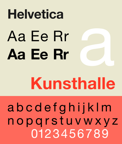
Image 1: a sample of the uses of Helvetic

As one walks many facades of modern life, the speed of ingenuity, innovation and diversity often render each day a whole new experience. As the saying goes. “There are only two constants in life, Death and taxes”, well there’s also Helvetica.


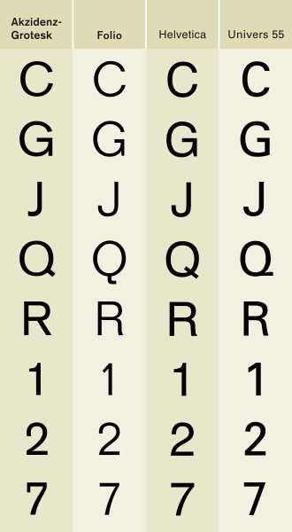
The unique qualities of the typeface has allowed for Helvetica to bloom and dominate the publication industry. Helvetica is a Grotesque Sans Serif Typeface under the Vox-ATypI classification (Typophile.com) method commonly used in typography, offering “smooth, clean lines, and an unobtrusive geometry” (Rohrer,F .2007) .


Created in 1957, by Swiss designers Max Miedinger and Eduard Hoffmann sought to create a font that would “capture the modernist preference for using clarity and simplicity to suggest greater ideas.”(Perks.M, 2007). Originally named “Neue Haas Grotesk , the name was subsequently changed due to its lengthy confusing brand to “Helvetica”, the Latin name of Switzerland paying not only homage to the origins of its designers but to invoke the reputation of clean, simple neutrality of which no doubt “its Swissness was part of the appeal.”(Rohrer.F ,2007) The typeface was aimed to compliment the ideas of the text, instead of standing out on itself.


Helvetica has since its conception become one the most popular, ubiquitous and successful typefaces of modernity. Considered the proponent of “a new visual era”(Dollar, S. 2007), Helvetica exploded onto the scene of the 1950s design industry quickly establishing the definition of the successful typeface. Its usage permeated the culture of the Anglophone world so profoundly that almost all facades of society be it corporate, governmental or personal adopted the simple yet effective typeface in order to best facilitate communication between people.

“Helvetica was immediately seized by the corporate sector as a brilliant way to jettison the fusty, fussy visual language of advertising. It also became the language of governmental authority. As such, it's the font used to represent everything from the Internal Revenue Service and the MTA, to Target and American Apparel.”(Dollar, S.2007)

Such was the dominance and significance of Helvetica in society that resonates to this day among corporate logos, government communication and even the undeniable hegemony of the typeface in the digital age. (Dollar,S .2007)

Its appeal has been often accredited to its design as “the typeface is clean-cut and simple, which means that it can be used as a neutral platform in a wide variety of settings” (Perks.M, 2007). However its very same qualities have been criticised by many designers for its “Bland uniformity” (Rohrer.F ,2007), Its critics such as designer Neville Brody have condemned it as  “a vehicle for social conformity through consumerism” (Rohrer.F ,2007). Its flexibility and neutrality that allows it to facilitate a broad array of situation and the conflicting criticisms for being overtly bleak and uninteresting are both thus Helvetica’s biggest flaw and greatest attribute.


However the interpretation of critics and designers of the publication industry, the influence and significance of Helvetica in modern typography, publication design and culture cannot be denied. In its role as one of the dominant typefaces for decades past and surely to come, Helvetica’s hegemony is no doubt a continuing phenomenon that defines modern typographical design.


Reference List

Dollar, Steve. 2007 “The Type Face to End all Typefaces”. The New York Sun.Accessed 3-7-2011. Source: http://www.nysun.com/arts/typeface-to-end-all-typefaces/62493/

Perks, Martyn. 2007 “Tracing the history of Helvetica” Spiked, London. Accessed 3-7-2011.Source: http://www.spiked-online.com/index.php/site/article/4123/

Rohrer, Finlo . 2007 “Helvetica at 50”. The British Broadcasting Company. Accessed 3-7-2011. Source: http://news.bbc.co.uk/2/hi/uk_news/magazine/6638423.stm

typophile.com.(2007).Source: http://typophile.com/node/13514

Image 1 is Taken from runnycustard.files.wordpress.com.Source: http://runnycustard.files.wordpress.com/2009/01/helvetica-font.jpg

Gill Sans


Gill Sans is based on classic roman proportions not geometric forms, its rounded letter forms and simplicity makes it remarkably legible. Designed to be a simple, functional and effective font, Gill Sans was initially suited to advertising posters, headlines, display signage and movie posters. It was superior to other fonts, such as Caslon and Baskerville, due to its visibility and universal lettering. However, as the public became more exposed to reading sans serif fonts, as opposed to traditional, embellished serif fonts, it became widely used for body text as well.

Working as a young apprentice with Edward Johnston, who designed the iconic Johnston Sans used in the London Underground in 1913, Eric Gill showed great competency and knowledge of type design. He reviewed Johnston Sans and as a sans serif font contained many notable errors. Gill set out to create a typeface which was not only legible for the sign writer or enamel plate maker, but also highly marketable with commercial potential, in order to compete with the German designed sans serif Futura. Contrary to Futura’s mathematically and mechanically designed lettering, Gill Sans was developed with the fluid, organic influence of his hand-writing. The ‘fool proof’ typeface was commercially released by Monotype in 1928. (Eric Gill, Essay on Typography, published 1931)


The original Gill Sans was released as metal type, however due to its popularity, legibility and great clarity, over thirty-six variations were developed. These variations were not mechanically derived from a single design, but rather by the Monotype office under Eric Gill’s guidance. Due to this there are many inconsistencies between weights and lettering across all the variations.
The Gill Sans font family ranges from Light to Ultra Bold, yet each weight has a distinct character of its own, and can often be mistaken as a derivative of a different font. The light font has an elegant look perfect for body text, while the extra bold and ultra bold are robust and full of character.

Gill Sans is classified as a humanist sans serif font, as it is similar in proportion to classical Roman lettering and has a distinct presence of the hand. The distinct eyeglass ‘g’ and top heavy ‘a’ shows the distinct roots of pen writing and gives the font an organic structure, rather than a mechanically derived one.

The typeface became popular in 1929 when it became the standard typeface for the London and North Eastern Railway (LNER). Gill Sans was being used on number plates, timetables, corporate logos and the iconic Penguin Books covers; giving Gill Sans international exposure and credit. It is now used as a staple font in many corporate logos, packaging design, body-text in books and more commonly on our Sydney street signs.

References:

http://www.monotypefonts.com/Library/HiddenGems.asp?show=gillsans
http://www.markboulton.co.uk/journal/comments/typeface-of-the-month-gill-sans
http://www.idsgn.org/posts/know-your-type-gill-sans/
http://msp.sfsu.edu/instructors/rsellers/fall_2000/f13b.html
http://vimeo.com/2984722

Sunday, March 6, 2011

Consolas


A B C D E F G H I J K L M N O P Q R S T U V W X Y Z 0 1 1 0 1 0 0 1 1 0 1 0 0
a b c d e f g h i h k l m n o p q r s t u v w x y z 1 0 1 1 0 0 1 1 1 0 1 0 0
1 2 3 4 5 6 7 8 9 0 0 0 0 0 1 1 0 0 1 0 1 0 0 1 1 0 1 0 0 1 1 0 0 0 1 0 1 1 0

Consolas belongs to a font family completely separate to those that most graphic designers are used to, such as the generic serif/sans serif types. This is called a ‘monospaced’ or non-proportional typeface, which means that each letter is of exactly the same width and height, and each space between the letters when written as text is also exactly the same. This is the main factor that separates fonts such as Consolas from traditional serif/sans serif typefaces, as those often have varying widths and heights of letters, as well as spaces between each letter. This gives Consolas a very uniform look when used as a block of text, and somewhat discreet when used as a label or a heading.

This font was made to mimic traditional typewriter style lettering. Typewriters then did not have the capacity to produce varying letter widths and heights, nor did they have the option for wider or narrower kerning. In effect, the text written on a typewriter would look much like this.

Consolas was traditionally used by computer programmers to write programming code, due to its uniformity and legibility on the screen. The even spacing made it easy for them to read, where something less even would leave more opportunity for mistakes in the code. Consolas was developed for Windows and Microsoft users, namely Windows 7, Windows Vista, Microsoft Office 2007, and Microsoft Visual Studio 2010. This font is part of a new font family that makes use of Microsoft’s ClearType font rendering technology, which is something that enables enlargement of the letters without aliasing (Wikipedia). Visually, Consolas is quite similar to Courier or Courier New, Lucida Console, and Monaco from the Mac operating system.

Consolas was developed by Lucas de Groot as a replacement font for Courier and Courier New. He claimed that those typefaces were inadequate for use by programmers, as they were too thin, and became easily aliased on a screen interface (Chaparro, Shaikh, Merkle, 2010).

It could be said that Consolas is merely an improvement of the original font Courier, which has its own history, and even symbolic and conceptual connotations. However Consolas is not clear of these connotations as it is, at face value, a very similar font. Courier, as well as being used for programming before the introduction of Consolas, was often used in the film industry, for script writing. The monospaced text in 12 point was used as a standard, or code, where one page translated to approximately one minute of time on the screen. On a more serious note, Courier was also used in official government documents, thus giving it a secretive stigma (Prepressure, 2010).

The varying uses of the monospaced typeface give it somewhat of a contradictory meaning, where on one hand, it is seen as vintage and nostalgic, yet on the other hand, it is viewed as progressive, and indicative of a digital age.


References


2010, ‘Courier’, Prepressure, accessed 5th March 2011, .

2011, ‘Consolas’, Wikipedia, accessed 5th March 2011, .

Chaparro, B. S. Shaikh, A. D. Chaparro A. Merkle E. C., 2010,
‘Comparing the legibility of six ClearType typefaces to Verdana and Times New Roman’, Information Design Journal 18(1), pp.36-49.

David Carson


Studying at San Diego State University, David Carson graduated with a BFA in sociology and was ranked top ten as a pro surfer. Starting at the age of 24, Carson got into design while teaching at a west coast high school when a simple advertisement for a design course caught his eye. After that he, studied at a commercial art school in Oregon (Newsweek 1996). David Carson is now a principal and chief director of his own design company, David Carson Design, Inc. with two main studios residing in Del Mar, CA and Zurich, Switzerland. This new designer crossed boundaries in design that have never been heard of in the public face of graphic design. As described in “The Font Youth”, an article published in Newsweek, his style is pure madness from mixing uppercase with lowercase and having hundreds of letters blurred over photographs dubs him as one of the most innovative designers in history. His first printed book, accompanied by Louis Blackwell, titled “The End of Print” was published in 1995 and sold a mere 200,000 copies and it was also translated in five different languages as well. The contents of the book are blatantly described just by the title of it. Essentially the book goes into depth about how print is ending and the new medium of digital has blown print out of the water. The book features specifically exhibitions throughout Europe, Asia, Latin America and Australia.
 In an interview by Layers Magazine, Carson talks about one of his books “The Rules of Graphic Design” and how his inspiration for this publishing related heavily to his studies in Switzerland. It features most of his newest works and the most essential part of the book, the official rules of graphic design. Also in the interview Carson was asked where he finds inspiration. He replied:
My environment always influences me. I’m always taking photos and I believe things I see and experience influence the work. Not directly, but indirectly in some shape or color or something that registers. The ocean has always played a big part in my life, but it’s hard to say exactly what that influence is in regards to the work. But I’m always scanning the environment I’m in, and I’m sure it ends up in the work. I think it’s really important that designers put themselves into the work. No one else has your background, upbringing, life experiences, and if you can put a bit of that into your work, two things will happen: you’ll enjoy the work more, and you’ll do your best work. Otherwise, we don’t really need designers—anyone can buy the same programs and learn to do “reasonable, safe” design.
This quote in particular is the key factor of what a good designer is, Carson couldn’t of said it better himself. Being a well-known graphic designer and typographer, Carson has also branched out into doing television and film where text is the main focus that portrays the message. Although it is a different medium Carson explains that he still approaches the situation as if he was designing for print. Once a pro surfer he is now one of the most influential designers.

Reference List:

 David Carson Design. 2011. Bio, David Carson. [ONLINE] Available at: http://www.davidcarsondesign.com/?dcdc=top/s. [Accessed 03 March 11].

Layers Magazine. Chad Neuman. 2007. An Interview With David Carson. [ONLINE] Available at: http://layersmagazine.com/an-interview-with-david-carson.html. [Accessed 06 March 11].

Newsweek. 1996. The Font of Youth. [ONLINE] Available at: http://www.newsweek.com/1996/02/25/the-font-of-youth.html. [Accessed 03 March 11].

helvetica


No one can really judge what the most popular typeface in the world is, however many people would strongly agree that Helvetica is up there at the top of the list, if not number one. In the 2007 documentary Helvetica directed and produced by Gary Hustwit, Michael Beirut points out, “Everywhere you look you see typefaces. But there's one you probably see more than any other one, and that's Helvetica. You know, there it is, and it seems to come from no where. You know, it seems like air? It seems like gravity?” (Helvetica, 2007). Beirut is just one of the many who live and die for this font.


The font dates back to 1957, when Max Miedenger got together with Eduard Hoffman to create this Swiss typeface. They designed the font in order for it to compete with a similar font that was popular at the time, Akzidenz-Grotesk. The original name for the font was actually Neue Haas Grotesk. In designing Helvetica, Miedenger and Hoffman set out “to create a neutral typeface that had great clarity, no intrinsic meaning in its form, and could be used on a wide variety of signage” (Wikipedia, 2011). The German company Stempel then changed the name of the font in 1960 from Neue Haas Grotesk to Helvetica, “in order to make it more marketable internationally” (Wikipedia, 2011).


An extremely simple and elegant font, Helvetica is classified as a Grotesque sans-serif. It can also be described as Lineal, when referencing the Vox-ATypI Classification of Type (Typophile, 2011). “The strokes in Helvetica are monotone in weight” (Typophile, 2011). Because of its “uniform, upright character”, Helvetica is also often referred to as an “anonymous sans serif” (Thinking With Type, 2007).


As I mentioned before, Helvetica is one of the most widely used fonts in the world. It’s simplicity and extreme readability make it an easy choice for a logo, billboard, storefront, magazine spread, you name it. It is aesthetically pleasing to the eye and gives off a very specific type of feel and emotion. American Apparel, American Airlines, Jeep, Panasonic, Target, Toyota, Microsoft, and Apple are just a few of the many companies who use Helvetica in their logos. All of these companies are able to provoke a specific feeling and brand their image by using the font, even though they are all so immensely different. “You can say, ‘I love you,’ in Helvetica. And you can say it with Helvetica Extra Light if you want to be really fancy. Or you can say it with the Extra Bold if it's really intensive and passionate, you know, and it might work.” (Helvetica, 2007). I love this quote by Massimo Vignelli because it is so true. Helvetica is such a flexible font that every variation portrays so many different kinds of emotions, and it portrays all of them perfectly.


Although Helvetica has been around for a while, it is still just as popular today as it was when it was first created. Some people argue that Helvetica is boring and over-simplified, but others, such as myself, find that the simplicity is the beauty of the font.


Reference List:


Helvetica. Dir. Gary Hustwit. Swiss Dots Ltd., 2007. Film.


2007. “Classification.” Thinking With Type. viewed 4 March 2011. http://www.papress.com/thinkingwithtype/letter/classification.htm.


2007. “Helvetica: A Documentary Film by Gary Hustwit”. Helvetica Film. viewed 4 March 2011. http://www.helveticafilm.com/about.html.


2010. “Helvetica”. Typophile. viewed 4 March 2011. http://typophile.com/node/13514.


2011. “Helvetica”. Wikipedia. viewed 4 March 2011. http://en.wikipedia.org/wiki/Helvetica.