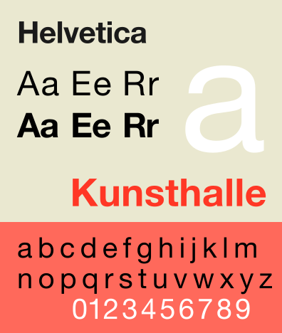
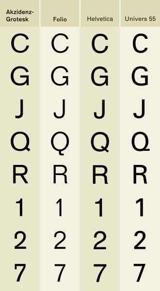
Helvetica was developed in 1957 by Max Miedinger. It was set out to be a new sans-serif typeface that could compete with the successful Akzidenz-Grotesk in the Swiss market. Originally called Neue Haas Grotesk, its design was based on Schelter-Grotesk and Haas’ Normal Grotesk. The aim of the new design was to create a neutral typeface that had a great clarity, with no intrinsic meaning in its form, and also could be used on a wide variety of signage.
There are variants of language in Helvetica.
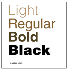
- Helvetica Light was designed by Erich Schultz-Anker, in conjunction with Arthur Ritzel.
- Helvetica Compress designed by Matthew Carter, they are narrow variants that are tighter than the Helvetica Condensed.
- Helvetica Textbook, an alternate design of the typeface. Some characters are drawn differently from the original version.
Different variants of Helvetica give out different feel and style of the design. Helvetica Ultra Light and Helvetica Light often appear on high end fashion magazine and fashion poster. The slim lines produce a stylish and elegant look, stands out from the background. Regular Helvetica used on normal documents such as articles and paragraphs. It’s clear and easy to read. Helvetica Bold is popular using on typography design, it stands out a lot and
the clear lines exaggerate positive and negative space.
Helvetica Neue is a reworking of the typeface with a more structurally unified set of heights and widths. Erik Spiekermann, the design consultant and designed the literature for the launch in 1983.

Helvetica is among the most widely used sans-serif typefaces. Many versions are existed for the following scripts: Latin, Cyrillic, Japanese, Korean, Hindi, etc. And, Chinese faces have been developed to complement Helvetica. It is a popular choice for commercial logos as well, including 3M, BMW, Toyota, Microsoft, American Airlines, and more.


Apple Inc. has used Helvetica widely in MAC OSX , iOS and the iPod. The iPhone 4 used Helvetica Neue.

New York City's Metropolitan Transportation Authority uses Helvetica for many of its subway signs, however the font, Helvetica was not adopted as the official font for signage until 1989.


Design Tshirts Store Graniph used Helvetica as their logo and typography designs on t-shirts.


Helvetica is also frequently used on fashion magazines, such as Oyster, VOGUE and COSMOPOLITAN.


Helvetica is also be a typography design which stands out alone and still obtain both visual and stylish look. It often use in poster, double-page spread and advertisement.
---------------------------
Reference
Edward M. Gottschall, Aaron Burns (1989). Typographic communications today. New York, NY : International Typeface Co.
Lars Müller (2004). Helvetica : homage to a typeface. Baden, Switzerland : Lars Müller
Nathan Gale (2002). Type 1 : digital typeface design. London : Laurence King
Nihon Taipogurafi Kyōkai (1985). Logotype, typeface, symbolmark, pictogram. 1984-1985 index. Tokyo : Rohbundo
No comments:
Post a Comment