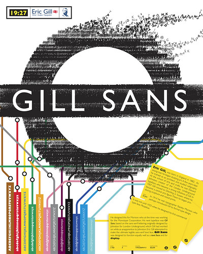
Gill sans is a sans-serif typeface designed by Eric Gill. Gill Sans was first seen as a shopfront sign in 1926, but only released as a single uppercase weight in 1928. This type was created by Eric Gill had been studying under the calligrapher and stonemason Edward Johnston who had recently designed the typeface for the London Underground. Gill had taken great influence from the style that Johnston had produced, and aimed to create the ultimate legible sans-serif font. Gill had initially just done sketches of the font until Stanley Morison wanted to turn it into a fully realized typeface to combat the likes of other typefaces being released in Germany at that time such as Futura, Kabel and Erbar.
Gill sans came to major popularity when it was commissioned to be used on the London and Northeast Railways, on all their posters and in all publicity material. Most people would be familiar with Gill Sans these days as it appears in many publications and is distributed as a standard font in most operating systems such as Microsoft and Apple.
The Gill Sans typeface family contains fourteen styles, and has less of a mechanical feel than geometric sans-serifs such as Futura, this is because its basic proportions are based on classic Roman letterforms, and not geometric shapes. Gill Sans also has a more pronounced contrast in stroke widths than most serifless fonts, making the design more appealing to the eye, and ultimately more readable than other single stroke fonts.
One reason for the enduring success of Gill Sans is the fact that each weight retains a distinct character of its own. The light font, with its heavily kerned ‘f’ and tall ‘t’, has an open, elegant look. The regular font has a more compact and muscular appearance, with its flat-bottomed ‘d’, flat-topped ‘p’ and ‘q’, and short, triangular-topped ‘t.’ The bold font tends to echo the softer, more open style of the light, while the extra bold and ultra bold have their own unique personalities. Gill Sans can seem friendly in its lighter weights, making it perfect for body text with its limited adornments and its rounded letterforms, making It good for magazine and book work. In Bold it makes for good signage displays, advertising, packaging and labels.
I feel that the font is clean and easy to read. The characters are hard, sculptured forms which show Gill’s artistic roots and an understanding of the way in which type should be read. It embraces traditional forms and proportions, which give the face a humanist feel.
From reading through blogs and publications, it appears that there are some negative opinions on the font, generally that it is overused. Other sources say that the basic glyph shapes do no look consistent across font weights and widths, especially in bold varieties. However, even in lighter forms of the font such as book and medium, the letters to not look consistent. The letter ‘a’ seems to be commonly negatively judged, critics say it is top heavy, unbalanced and overall weird looking.
Rounding out the practical benefits of Gill Sans: The face is space-economical. More information can be set in a given space when using Gill Sans than with most other sans serif designs.
Millington, Roy (2002). Stephenson Blake: The Last of the Old English Typefounders. Oak Knoll Press.
Boulton, Mark (2008). Typeface of the month, Gill Sans. www.markboulton.co.uk/journal
http://www.fonts.com/FindFonts/RecentReleases/2005/GillSansPro.htm Fonts.com.
http://www.monotypefonts.com/Library/HiddenGems.asp?show - Monotype fonts
No comments:
Post a Comment