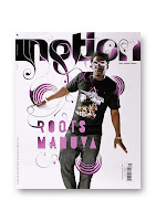
Si Scott's works are mostly illustrated and very decorative. He usually draw his artwork cross over double pages or extended from the original image.
Here are my initial design ideas, I'm playing with 3 colours, orange, green and blue. I made the cover go along with the layout. Here are the screen grab of the BLAD designs.
After consulting with Wing, he gave me advice of combining the elements of the green and blue to create a better BLAD in terms on both image display and type arrangement.


No comments:
Post a Comment